App Launch
When someone opens an app launch page, they should not need to study it for several minutes before understanding what the product does. The goal of the page is to make the value of your app clear enough that a visitor can decide whether to explore it further.
A good launch page combines a few simple elements: a clear name, a useful tagline, an understandable description, screenshots that show the product in action, and a short maker message that gives the launch some context.
1. Make the app name and tagline work together
Your app name identifies the product. Your tagline should explain what it helps people do. If the app name is abstract, the tagline becomes even more important because it provides immediate context.
Keep the tagline simple
A strong tagline is usually easier to understand when it focuses on the main outcome rather than trying to list every feature. Avoid filling it with technical language unless the target audience genuinely expects it.
FocusFlow — Plan less. Focus more. Finish better.
That short line does not describe every screen in the product, but it gives users a quick idea of the experience and the problem the app is trying to solve.
2. Use screenshots to explain the product
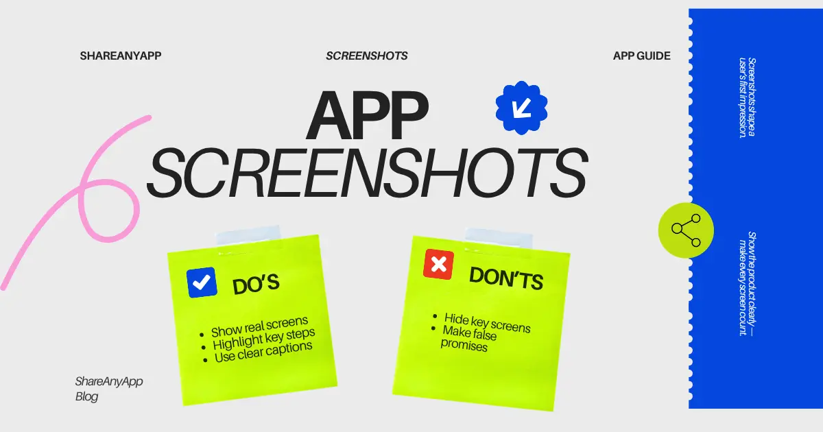
Screenshots should help the visitor understand what the app looks like and what they can do with it. A useful screenshot sequence often begins with the most important workflow rather than an account screen or a generic splash screen.
- Show the core product experience first.
- Use screenshots that demonstrate different useful actions.
- Avoid several images that all communicate the same thing.
- Keep the visual order easy to follow from left to right.
- Make sure important interface details remain readable.
If you add text around screenshots, the message should support the visual rather than repeat a long paragraph. The combination should help a user understand the benefit faster.
3. Write the description for scanning first
Many visitors will scan the page before reading it carefully. Put the most important information near the beginning. Explain what the app does, who it is for, and why someone might use it.
Then move into supporting features, workflows, or differentiators. If the description starts with company history or a long introduction, the core product message can get lost.
A simple structure
- Opening: explain the main purpose of the app.
- Use cases: show when or why someone would use it.
- Features: list the capabilities that support the main value.
- Platforms: make availability clear.
- Next step: give users a clear path to try or visit the product.
4. Add a maker message that sounds human
A launch message is a useful place to explain why you built the product, what problem you were trying to solve, or what kind of feedback you are looking for.
It does not need to sound like a press release. A short, direct message can make the launch feel more personal and give the community a reason to start a conversation.
We built FocusFlow because our own planning process had become too complicated. We wanted a smaller workspace that helps people choose what matters today and stay focused. We would especially love feedback on the weekly planning flow.
5. Review the page before launch
Before publishing, open the page as if you were seeing the app for the first time. Look for missing context, broken links, unclear screenshots, or text that assumes too much knowledge.
 App name and tagline clearly explain the product.
Keep improving after launch
A launch page does not have to stay frozen forever. Reviews, comments, and repeated questions can show you where the page is still unclear. If several users misunderstand the same feature, the problem may be the presentation rather than the product itself.
Use your listing as a living product page: keep the information accurate, improve screenshots when the product changes, and respond to useful community feedback.
Common questions
What should an app launch page explain first?
Start with what the app helps people do and who it is for. Then show the main workflow, important requirements, and a clear next step.
How many screenshots should I include?
There is no fixed number that fits every product. Use enough current screenshots to explain the core workflow and distinct benefits, and remove images that repeat the same point.
What belongs in a maker launch message?
Explain why you built the app, what is ready today, and the specific kind of feedback that would help you improve it.