
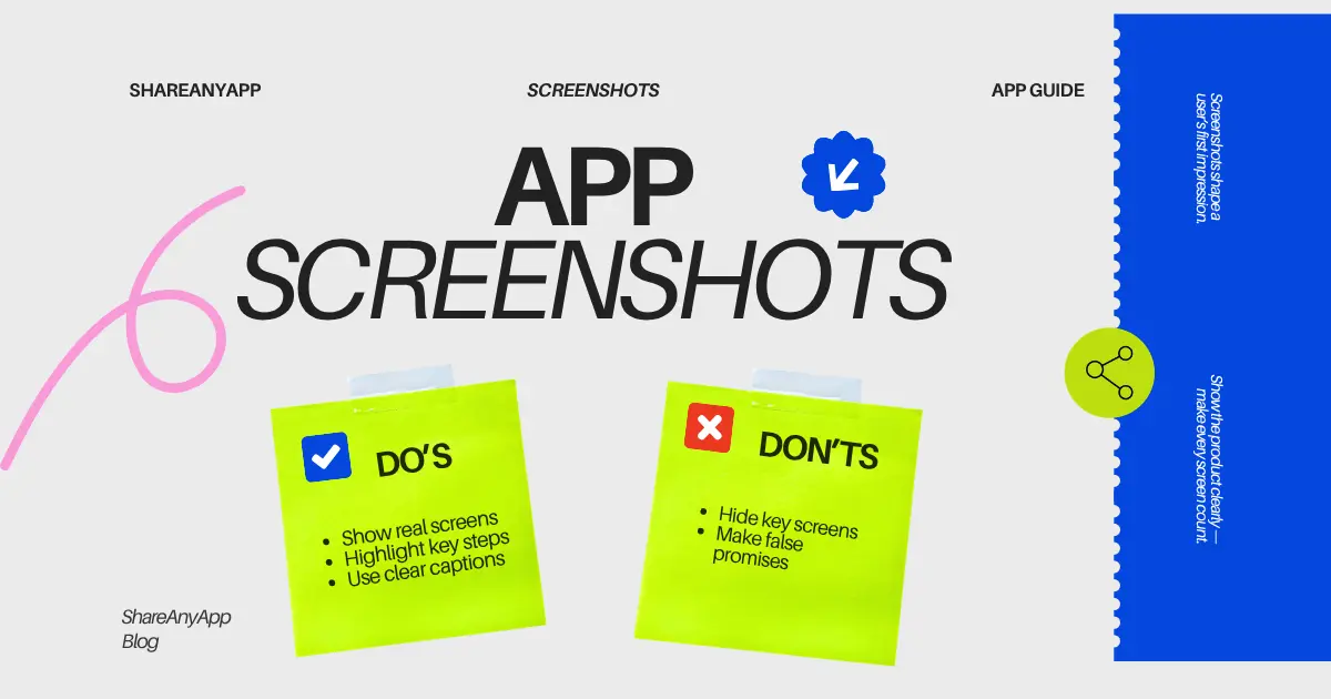
App screenshots are often the first detailed look a visitor gets at the product. Their job is to make the experience easier to imagine, not to compensate for an unclear product or promise results that the software cannot deliver.
Build a sequence around a user task
Choose one common task and order the images so they tell a small story: where the user starts, what they do, and what outcome the app supports. Lead with the screen that best represents the product. Do not make visitors swipe past splash screens, sign-in forms, or repeated views before they see its value.
- Show the main use case.
- Show a meaningful step or decision in the workflow.
- Show a result, saved state, or collaboration moment.
- Use later images for secondary features that matter to the audience.
Capture the product accurately
Use current interface screens and real product states. Remove personal information from sample data, avoid fabricated reviews or metrics, and do not present a mockup as a live feature. If you enhance the images with frames or captions, keep the underlying product recognizable.
Write captions that add context
A caption should explain the benefit of the screen or name the action a person can take. Keep it concise and specific. “See your week at a glance” gives more context than “Powerful calendar.” Avoid stacking superlatives that could apply to any app.
Generic: “The ultimate productivity experience.”
Specific: “Move unfinished tasks into next week without losing their notes.”
Make sure text contrasts with the background and remains readable at the actual listing size. Important claims should not be hidden in small decorative copy.
Review screenshots as a new visitor
- Can a person tell what kind of app this is from the first image?
- Does each image communicate something new?
- Is the interface current and consistent with the live product?
- Can captions be read on a smaller phone?
- Do examples avoid exposing user data or confidential content?
Ask a target user to describe what they think each image shows. Confusion is a sign to change the order, simplify the screen, or improve the caption. You do not need elaborate art direction; a truthful, legible walkthrough is often the better starting point.
Common questions
How many screenshots should an app listing have?
Use enough to explain the main workflow and important differentiators. The exact number depends on the listing format and the product; every image should add information.
Should I add captions to app screenshots?
Captions can help when they clarify a task or outcome. Keep them readable, accurate, and brief.
Can I use mockups instead of real screenshots?
You can use a clearly illustrative mockup, but do not misrepresent it as a current product screen or imply unsupported features.
Put your next launch in front of curious people
Create a clear listing, share it with relevant communities, and invite useful feedback. Discovery takes steady work; no directory can promise a particular reach or result.
Share an app on ShareAnyApp